An Interview with Heath West

An interview with Heath West by Jacob van Loon
Heath West is a multimedia artist who lives and works in Houston, Texas. His experience with art is intertwined with a stated background in architecture; he holds a Master of Architecture from Houston University and a Master of Science in Advanced Architectural Design from Columbia University. Since 2014, West’s artworks have been displayed from coast to coast, with his first solo show taking place earlier in 2015 at Castor Gallery in New York City.
In the last two years, his process has metamorphosed from printed digital color manipulations suspended inside fabricated plexiglass boxes into tactile handmade weavings and constructed frames. Through the material changes, Heath’s work maintains a relevant art-historical basis while participating in contemporary ideological discussion. The action behind his work is intuitive and unflinching. Heath’s paintings are a consideration of color, space, and abstraction, recalling characteristics of the preceding color field and hard edge painters, as well as the French Supports/Surfaces group from the 1970’s.
As a well-traveled seeker of knowledge, Heath’s body of work is an amalgamation of self-posed questions. Each individual work acts as pictorial documentation of his search for answers, or just better questions to ask. I met with Heath both at his live-work studio and the recent Barnett Newman exhibition at Menil in Houston to talk about his work, his experience with architecture, his influences, and an early crush.

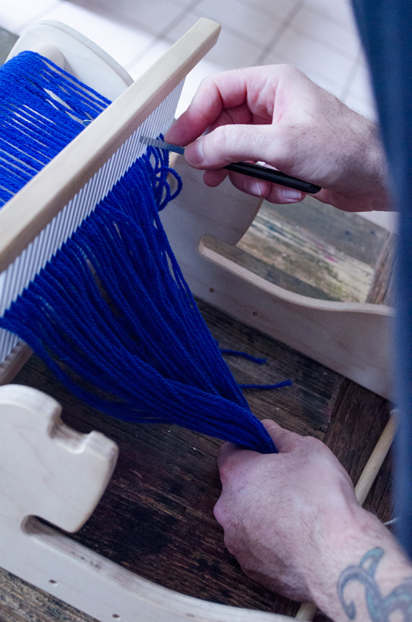
Heath West. Photo by Jacob Van Loon
Because weaving is new to you, what attention are you giving craft and how much of your process is lent to what naturally happens when you experiment? Flaws, blemishes, that sort of thing.
I’ve been making [frames] since architecture school — that comes from model making. The desire to keep making those frames basically comes from architecture. The fabric itself, once I determine how intricate the process is of constructing a surface, there’s lots of room for error. In the room for error [the viewer] can identify the hand of the artist, where I can shift things to make the weaving unique.
Is error something you play off of when creating these weaves?
I’d much rather have a unique piece, nothing machine-like. You can spot the difference between something that’s handcrafted versus something that’s machine-made. Mechanically produced objects are perfect; the mechanical process refines errors. My inability to ensure even tension and rows is what makes the surface more interesting; the ability to have it varied.
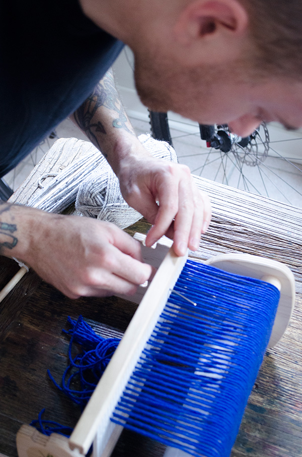
Heath at the loom. Photos by Jacob van Loon
You use a lot of different colors in your work. You pick colored yarns individually and when those layer in the weave they create optical blends that appear as new hues.
Exactly, but I have an idea of what the end result is.
You previously used color in mockups for some of your work. Do you still work from mockups?
Lately it’s just been matching the colors. Previously I would have made an Illustrator file of a grid and then I would change out certain colors and see what would look good together. Mockups started to become an unnecessary step.
How much do movies or moving images have to do with your work? Deleuze is a name that comes up when you have discussed your own work in the past.
He has a couple books on cinema. His writing has been important to me since school. Why so many architecture professors gravitate towards him is probably just because his concepts are spatial. Movies certainly influence my work. I had a theory professor in school who suggested we watch three films a day in order to educate ourselves with different cultures. He also encouraged the use of psychedelic mushrooms, but that’s another story. While I don’t watch three films a day, usually only one a day, it is incredibly important to see how directors from anywhere in the world interpret their story with the technology of the camera. Camera movements, perspectives, color, sound, all of these issues contribute to the mood of a film, and their lessons can be extracted and applied to making art. It’s the same with philosophy. The lessons in books are to be activated and applied, not simply reiterated.
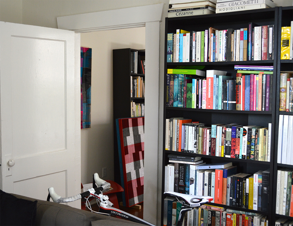
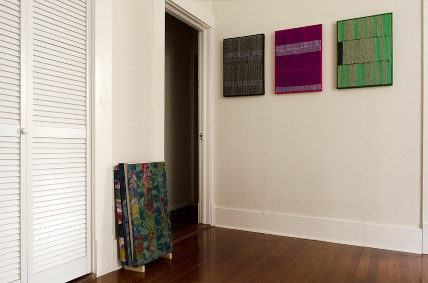
Glimpses of West’s studio. Photos by Heath West and Jacob van Loon
Many of your weavings appear to be around the size of a window. Some of the very recent pieces have the same exaggerated vertical orientation as the windows in your apartment.
I like things oriented in portrait mode because I feel it has a greater 1:1 alignment with the body, when you’re looking a vertically oriented piece on the wall. I’ve pinned the weavings up and turned them horizontal to make it look like a landscape and to me it feels like I’m looking at a decapitated work. It feels like just the head with no body. When I have it vertically oriented, I feel like the body is complete.

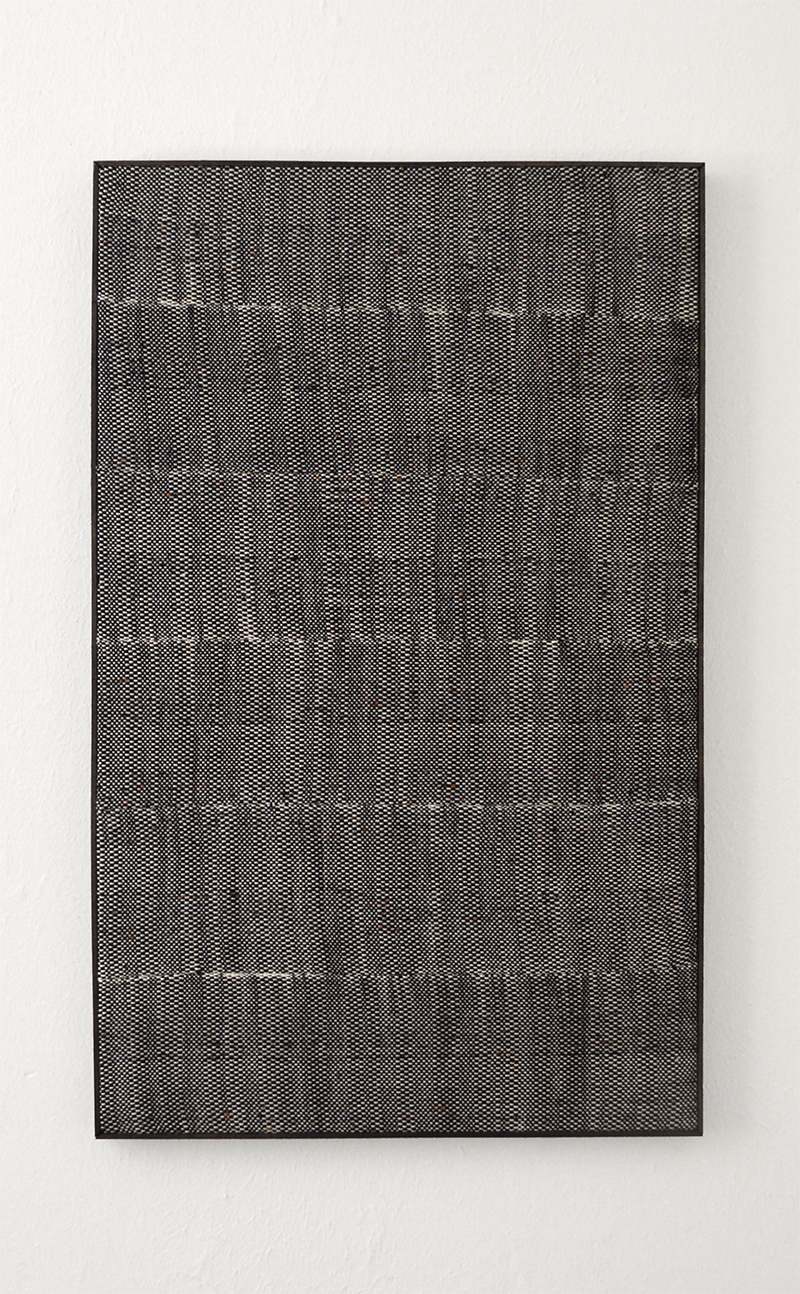
Brave men run, into the setting sun
Handwoven acrylic fabric, sewn, stain on pine
42.75 x 29.75 in. (108.6 x 75.6 cm)
2015
You made some floor-standing standing pieces using screens and mesh. Do you have interest in experimenting with sculpture?
I do have an interest making sculpture. I was happy with how the frame/screen sculpture turned out, but I’ll have wait and see what happens next. It all depends on the materials, and if they’re right for the project or not. Maybe something with heavy timber and formed concrete? We’ll see.
How important is your background in architecture to the design of your pieces?
There was a day when I had to decide if I wanted to go to school for the MFA or for M.Arch. I thought I would have a good job when I graduated architecture school. If I would have gone for the MFA I would have picked painting. I know it. That’s what would have happened. I loved architecture school, and I had to go to architecture school to make art. That’s just the way it’s turned out. I wouldn’t change the experience. School is where I learned about Iannis Xenakis and his work with Le Corbusier. Xenakis worked for Le Corbusier from 1956-1960, they worked on La Tourette together. Xenakis designed the window distribution on three exterior facades of the building. As a composer, Xenakis designed the mullion structure for the windows in a way that resembles his music. There was a deliberate abstract rhythm to the window design and their relationship to light and space. Like all art, you have to experience it person. No .jpg will ever recreate the spatial experience of that building. Cinema gets pretty close, but still…it’s worth a trip to France just to visit that building.
Are there other moments from your past that still influence your work?
Having a seminar with Rosalind Krauss was definitely one of the top highlights of my education. I’ve been reading her for years even before I got to Columbia, and when I entered her course, I was so happy. I couldn’t believe I was sitting there with such an important thinker and writer of art, and being able to listen and engage with her was very exciting. We read a lot of Heidegger. A lot. I had a seminar with Sanford Kwinter while I was a visiting student in Vienna. We did close readings of Deleuze and Guatarri’s Smooth and Striated. I also had Bernard Tschumi for history and theory in architecture [from 1968 to the present]. It was a real treat to sit a small room and discuss architectural ideas. No employer I’ve ever had while working in an architecture office has ever done that, which makes me think that not too many practicing architects have ideas to begin with.
Mistress to the Horror Kid
Handwoven acrylic fabric, sewn, stain on pine
42.75 x 26.75 in. (108.5 x 67.9 cm)
2015

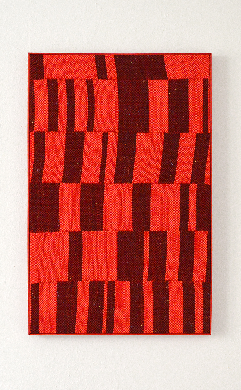
Death Valley ‘69
Handwoven acrylic fabric, sewn, stain on pine
21.75 x 16.75 in. (55.2 x 42.5 cm)
2015
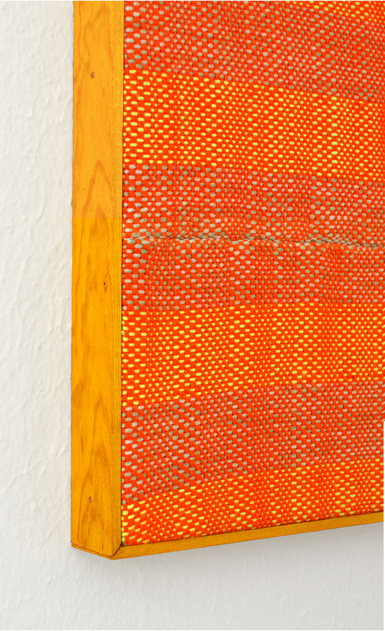
Side detail of Death Valley ‘69
What is significant about the relationship between architecture and philosophy?
Architecture envelopes society. It creates social spaces. At least this is what good architecture does, as there’s a lot of architecture that doesn’t do anything. Good architecture has an effect on culture. A well-balanced architect or artist, rather, has both conceptual and social consideration combined into whatever they use for material. I think that’s why history and theory is so important to architecture. What’s disappointing about the industry is that very few people address these issues. My experience, from the offices that I have been in, is that they don’t talk about history. I know for a fact that some firms do, but it’s surprising how many don’t.
Architecture is divided between academics and practitioners. Sure, some do both, but for the most part that’s how the field works. Then there are different types of schools. Design schools that have a historic and theoretical approach to how their students should be working, and then the engineering-based tech schools, which are more pragmatic in terms of educating their students with construction. I come from design schools with a background in history and theory. When I graduated in 2009 in the middle of the recession, there were no jobs. None. It’s gotten a little better, but the job market for architects is unstable, and things are starting to go down again. With the profession of architecture dependent on the oil industry for projects especially in Texas, once there’s a slowing in oil, given enough time, the domino effect will start knocking things down. There are too many architects looking for work, and not enough jobs in the industry to fill them. It’s frustrating and disappointing.
What are some architectural firms that interest you?
OMA, Rem Koolhaas and partners. Rem is now this old wise man of architecture; anyone that works for him and goes to do their own thing always seems to do very good design and has sensitivity to materials and space, like MVRDV and BIG. Many contemporary Japanese architects are making interesting and low cost houses. SANAA is a Japanese office partnership and their work is minimal, but very beautiful. Skinny shoestring columns, lots of mirrors and floor to ceiling glass, very light. The buildings seem like they’re almost invisible.
Architecture addresses sustainability on a variety of levels. Cities always have a mixture of buildings new and old, it’s like the maintenance of history.
Houston has the problem of wiping out its own history and rebuilding. As an example, Japan’s wipeout was forced. You see a lot of bizarre architecture there. In Europe, especially in places like Germany and Austria, there are old bullets lodged in the facades of buildings. You see the combination of buildings that were there during the wars, then there’s a brand new building right next to those buildings. In some cities, you can read its history that way. Houston will just bulldoze something and then put up something, things turn around so fast. New buildings are going up all over the city. If you went downtown today, you’d see a lot of cranes.

Slow Death
Handwoven acrylic fabric, sewn, stain on pine
42.75 x 31.75 in. (108.58 x 80.64 cm)
2015
Your process has changed since I first came across your work a few years ago, with the digitally composed imagery, the printed papers and manufactured plexi cases as methods of fabrication. What if anything do the weavings share in common with your earlier work?
The process of hand weaving is very similar to my previous digital work in the sense of layering color space. But the materiality of a handwoven fabric has a much different feel or sense than a printed image. At the same time, the tactile complexity of the woven fabric has a pixel-like detail, and with the combination of bright and neon yarns, weaving is an analogue reference to our HD zeitgeist. Making has always been important to me, much more so than anything digital. There are points of reductive logic in a studio process, which often leads to points of departure into something else, but rooted in what happened before. I was bored of buying off-the-shelf stretcher pieces to build my frames. I bought a miter saw and lumber and started making them myself. Finding the right lumber yard took some time, too. It’s a much cheaper way to make more art. Reduce material costs, make more art. The prints in their plexi cases were too expensive to make. But I built upon the thought behind those works, and it has helped me make new decisions in my work today.
Your work addresses historical art, but you’re creating new images through a contemporary lens.
I use an old process, I’m deliberately going against printing and the ease of digital manufacturing. To me, it was easy to press a button and send a file to a printer, whereas weaving is hands on; it’s a time-consuming process. I get much more satisfaction out of making something with my hands instead of just printing something. Weaving in modern art can go back to the Bauhaus, even before the First World War.
After reading enough Derrida, I began to think in terms of deconstruction, which is a very tectonic or architectural method of thinking. Keep breaking something down until you reach the essence of what it is. In approaching painting this way, we can determine that a painting is a colored surface stretched over a frame and displayed on a wall. This is the conventional idea. If you keep deconstructing that idea, you can reach other conclusions about a painting. Some people pull the painting off the wall completely to make standing paintings while others hang them from roof beams. I always come back to the surface as the main issue of concern in painting. If the surface of painting is colored fabric, what other methods can achieve this same goal? Can I achieve this goal without paint at all? I’m not trained as a painter but as an architect, so the construction of a painting from the ground up, with a combination of weaving, sewing, and woodworking just made sense to me. Previous digital design and then printing always left me feeling flat.

Want you coocoo cannonball
Handwoven acrylic fabric, sewn, stain on pine
34 3/8 x 24 3/8 in. (87.2 x 61.8 cm)
2015
I’ve followed your network for a few years now, and sometimes you’ll post other artworks, and more often you’ll post things about the music you listen to.
Music has always been important to me. I grew up skateboarding and had friends in punk bands, so I was going to shows since junior high in California.
You use verbiage from the music you listen to in the titles for your work. Earlier on you had a numbering system you used for titling, so what changed?
After a while I decided I was bored with the numbering and I was more interested in something lyrical and personal in titling a piece. A title is an opportunity to give the work some type of personal reference.
So you’re providing narrative with the title?
Another reason I wanted to title lyrically was to give the work more reference to culture. I finished a piece recently called Death Disco. Something about that Public Image Ltd. title was in my head, I had been playing the album a lot lately, so it just kind of felt right when I put that piece on the wall. I looked at it, and thought “Death Disco.” The title points to origin. It comes from the album and the song, and I think about the background of PIL, their music, and their contribution to culture. I like coming across a lyric and something about a certain wordage in a song… For example, titling a piece after a Siouxsie and the Banshees song. Siouxsie was the first woman I fell in love with, when I didn’t know what women were about. But I saw her on the television and thought “oh, who’s that?” So for me, Siouxsie and the Banshees has always been a personal thing. To use a lyric from one of her songs feels like I’m putting even more personal reference into the piece.
Death Disco
Handwoven acrylic fabric, sewn, stain on pine
39.75 x 25.75 in. (100.96 x 65.4 cm)
2015
Give me a rundown of what you’re currently reading.
Painting as Model, by Yve-alain Bois. Essays on histories of modernism, with theoretical analyses of color and space in composition. Bois’ writing style has personality and isn’t purely academic. All good art criticism aims to improve the current field by learning from the past. It’s important not only to build from what work we have made previously but also what has been made before in the spectrum of history, and why.
My Struggle: book 2, by Karl Ove Knausgaard. This book is about Knausgaard meeting and falling love with his second wife, and the birth of their first child. I know that sounds like People Magazine at the checkout counter, but the books are much more than that. There are very personal and philosophical undertones—or direct tones for that matter—to his very clear, but emotional writing style. It’s masochistic to read only art criticism or philosophy. Knausgaard addresses the sensitivity of the modern relationship, and is a good read to slow things down a bit.
Blinky Palermo, Retrospective 1964-1977. A great book about a great artist, with critical essays on Palermo’s works and their relationships to the zeitgeist of when they were made, and relevance today. As one of my favorites, this is an excellent reference book for close readings into his work.
Intellectualism is part of your process and being well read is part of what you make. When people are looking at your work, how much of that viewership has to be committed to that conceptual driving force versus an immediate reaction to the appearance of the work and the aesthetic?
The end result is what matters. The process can mean everything to me, and mean absolutely nothing to someone sees the finished work in a gallery. In no way do I want my work to only be understood by people who read the same books as I do. I would much rather the art be approachable by all people. That would make me most happy.
–
Starting July 10, Heath will be showing at Summer Party Too, a group exhibition at Hello Project Gallery in Houston. His work will also be featured in Sun Spots, a group exhibition at Big Medium in Austin, opening July 17.
Heath West online
Heath West on Tumblr
Heath West on Instagram
Jacob Van Loon paints and draws outside of Chicago.

No comments yet.